Binning and Aggregation
We have discussed data, marks, encodings, and encoding types. The next essential piece of Altair’s API is its approach to binning and aggregating data
import altair as alt
from vega_datasets import data
cars = data.cars()

cars.head()
| Name | Miles_per_Gallon | Cylinders | Displacement | Horsepower | Weight_in_lbs | Acceleration | Year | Origin | |
|---|---|---|---|---|---|---|---|---|---|
| 0 | chevrolet chevelle malibu | 18.0 | 8 | 307.0 | 130.0 | 3504 | 12.0 | 1970-01-01 | USA |
| 1 | buick skylark 320 | 15.0 | 8 | 350.0 | 165.0 | 3693 | 11.5 | 1970-01-01 | USA |
| 2 | plymouth satellite | 18.0 | 8 | 318.0 | 150.0 | 3436 | 11.0 | 1970-01-01 | USA |
| 3 | amc rebel sst | 16.0 | 8 | 304.0 | 150.0 | 3433 | 12.0 | 1970-01-01 | USA |
| 4 | ford torino | 17.0 | 8 | 302.0 | 140.0 | 3449 | 10.5 | 1970-01-01 | USA |
Group-By in Pandas
One key operation in data exploration is the group-by, discussed in detail in Chaper 4 of the Python Data Science Handbook. In short, the group-by splits the data according to some condition, applies some aggregation within those groups, and then combines the data back together:
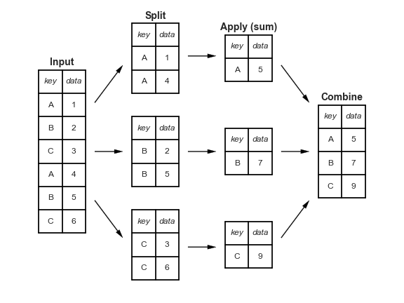
For the cars data, you might split by Origin, compute the mean of the miles per gallon, and then combine the results. In Pandas, the operation looks like this:
cars.groupby('Origin')['Miles_per_Gallon'].mean()
Origin
Europe    27.891429
Japan     30.450633
USA       20.083534
Name: Miles_per_Gallon, dtype: float64
In Altair, this sort of split-apply-combine can be performed by passing an aggregation operator within a string to any encoding. For example, we can display a plot representing the above aggregation as follows:
alt.Chart(cars).mark_bar().encode(
    y='Origin',
    x='mean(Miles_per_Gallon)'
)
Notice that the grouping is done implicitly within the encodings: here we group only by Origin, then compute the mean over each group.
One-dimensional Binnings: Histograms
One of the most common uses of binning is the creation of histograms. For example, here is a histogram of miles per gallon:
alt.Chart(cars).mark_bar().encode(
    alt.X('Miles_per_Gallon', bin=True),
    alt.Y('count()'),
    alt.Color('Origin')
)
One interesting thing that Altair’s declarative approach allows us to start assigning these values to different encodings, to see other views of the exact same data.
So, for example, if we assign the binned miles per gallon to the color, we get this view of the data:
alt.Chart(cars).mark_bar().encode(
    color=alt.Color('Miles_per_Gallon', bin=True),
    x='count()',
    y='Origin'
)
This gives us a better appreciation of the proportion of MPG within each country.
If we wish, we can normalize the counts on the x-axis to compare proportions directly:
alt.Chart(cars).mark_bar().encode(
    color=alt.Color('Miles_per_Gallon', bin=True),
    x=alt.X('count()', stack='normalize'),
    y='Origin'
)
We see that well over half of US cars were in the “low mileage” category.
Changing the encoding again, let’s map the color to the count instead:
alt.Chart(cars).mark_rect().encode(
    x=alt.X('Miles_per_Gallon', bin=alt.Bin(maxbins=20)),
    color='count()',
    y='Origin',
)
Now we see the same dataset as a heat map!
This is one of the beautiful things about Altair: it shows you through its API grammar the relationships between different chart types: for example, a 2D heatmap encodes the same data as a stacked histogram!
Other aggregates
Aggregates can also be used with data that is only implicitly binned. For example, look at this plot of MPG over time:
alt.Chart(cars).mark_point().encode(
    x='Year:T',
    color='Origin',
    y='Miles_per_Gallon'
)
The fact that the points overlap so much makes it difficult to see important parts of the data; we can make it clearer by plotting the mean in each group (here, the mean of each Year/Country combination):
alt.Chart(cars).mark_line().encode(
    x='Year:T',
    color='Origin',
    y='mean(Miles_per_Gallon)'
)
The mean aggregate only tells part of the story, though: Altair also provides built-in tools to compute the lower and upper bounds of confidence intervals on the mean.
We can use mark_area() here, and specify the lower and upper bounds of the area using y and y2:
alt.Chart(cars).mark_area(opacity=0.3).encode(
    x='Year:T',
    color='Origin',
    y='ci0(Miles_per_Gallon)',
    y2='ci1(Miles_per_Gallon)'
)
Time Binnings
One special kind of binning is the grouping of temporal values by aspects of the date: for example, month of year, or day of months. To explore this, let’s look at a simple dataset consisting of average temperatures in Seattle:
temps = data.seattle_temps()
temps.head()
| date | temp | |
|---|---|---|
| 0 | 2010-01-01 00:00:00 | 39.4 |
| 1 | 2010-01-01 01:00:00 | 39.2 |
| 2 | 2010-01-01 02:00:00 | 39.0 |
| 3 | 2010-01-01 03:00:00 | 38.9 |
| 4 | 2010-01-01 04:00:00 | 38.8 |
If we try to plot this data with Altair, we will get a MaxRowsError:
alt.Chart(temps).mark_line().encode(
    x='date:T',
    y='temp:Q'
)
---------------------------------------------------------------------------
MaxRowsError                              Traceback (most recent call last)
/opt/hostedtoolcache/Python/3.7.7/x64/lib/python3.7/site-packages/altair/vegalite/v4/api.py in to_dict(self, *args, **kwargs)
    361         copy = self.copy(deep=False)
    362         original_data = getattr(copy, "data", Undefined)
--> 363         copy.data = _prepare_data(original_data, context)
    364
    365         if original_data is not Undefined:

/opt/hostedtoolcache/Python/3.7.7/x64/lib/python3.7/site-packages/altair/vegalite/v4/api.py in _prepare_data(data, context)
     82     # convert dataframes  or objects with __geo_interface__ to dict
     83     if isinstance(data, pd.DataFrame) or hasattr(data, "__geo_interface__"):
---> 84         data = _pipe(data, data_transformers.get())
     85
     86     # convert string input to a URLData

/opt/hostedtoolcache/Python/3.7.7/x64/lib/python3.7/site-packages/toolz/functoolz.py in pipe(data, *funcs)
    632     """
    633     for func in funcs:
--> 634         data = func(data)
    635     return data
    636

/opt/hostedtoolcache/Python/3.7.7/x64/lib/python3.7/site-packages/toolz/functoolz.py in __call__(self, *args, **kwargs)
    301     def __call__(self, *args, **kwargs):
    302         try:
--> 303             return self._partial(*args, **kwargs)
    304         except TypeError as exc:
    305             if self._should_curry(args, kwargs, exc):

/opt/hostedtoolcache/Python/3.7.7/x64/lib/python3.7/site-packages/altair/vegalite/data.py in default_data_transformer(data, max_rows)
     17 @curried.curry
     18 def default_data_transformer(data, max_rows=5000):
---> 19     return curried.pipe(data, limit_rows(max_rows=max_rows), to_values)
     20
     21

/opt/hostedtoolcache/Python/3.7.7/x64/lib/python3.7/site-packages/toolz/functoolz.py in pipe(data, *funcs)
    632     """
    633     for func in funcs:
--> 634         data = func(data)
    635     return data
    636

/opt/hostedtoolcache/Python/3.7.7/x64/lib/python3.7/site-packages/toolz/functoolz.py in __call__(self, *args, **kwargs)
    301     def __call__(self, *args, **kwargs):
    302         try:
--> 303             return self._partial(*args, **kwargs)
    304         except TypeError as exc:
    305             if self._should_curry(args, kwargs, exc):

/opt/hostedtoolcache/Python/3.7.7/x64/lib/python3.7/site-packages/altair/utils/data.py in limit_rows(data, max_rows)
     82             "than the maximum allowed ({}). "
     83             "For information on how to plot larger datasets "
---> 84             "in Altair, see the documentation".format(max_rows)
     85         )
     86     return data

MaxRowsError: The number of rows in your dataset is greater than the maximum allowed (5000). For information on how to plot larger datasets in Altair, see the documentation
alt.Chart(...)
len(temps)
8759
Aside: How Altair Encodes Data
We chose to raise a MaxRowsError for datasets larger than 5000 rows because of our observation of students using Altair, because unless you think about how your data is being represented, it’s quite easy to end up with very large notebooks inwhich performance will suffer.
When you pass a pandas dataframe to an Altair chart, the result is that the data is converted to JSON and stored in the chart specification. This specification is then embedded in the output of your notebook, and if you make a few dozen charts this way with a large enough dataset, it can significantly slow down your machine.
So how to get around the error? A few ways:
Use a smaller dataset. For example, we could use Pandas to aggregate the temperatures by day:
import pandas as pd
temps = temps.groupby(pd.DatetimeIndex(temps.date).date).mean().reset_index()
Disable the MaxRowsError using
alt.data_transformers.enable('default', max_rows=None)
But note this can lead to very large notebooks if you’re not careful.
Serve your data from a local threaded server. The altair data server package makes this easy.
alt.data_transformers.enable('data_server')
Note that this approach may not work on some cloud-based Jupyter notebook services.
Use a URL which points to the data source. Creating a
gistis a quick and easy way to store frequently used data.
We’ll do the latter here, which is the most convenient and leads to the best performance. All of the sources in vega_datasets contain a url property.
temps = data.seattle_temps.url
alt.Chart(temps).mark_line().to_dict()
{'config': {'view': {'continuousWidth': 400, 'continuousHeight': 300}},
 'data': {'url': 'https://vega.github.io/vega-datasets/data/seattle-temps.csv'},
 'mark': 'line',
 '$schema': 'https://vega.github.io/schema/vega-lite/v4.8.1.json'}
Notice that instead of including the entire dataset only the url is used.
Now lets try again with our plot
alt.Chart(temps).mark_line().encode(
    x='date:T',
    y='temp:Q'
)
This data is a little bit crowded; suppose we would like to bin this data by month. We’ll do this using TimeUnit Transform on the date:
alt.Chart(temps).mark_point().encode(
    x=alt.X('month(date):T'),
    y='temp:Q'
)
This might be clearer if we now aggregate the temperatures:
alt.Chart(temps).mark_bar().encode(
    x=alt.X('month(date):O'),
    y='mean(temp):Q'
)
We can also split dates two different ways to produce interesting views of the data; for example:
alt.Chart(temps).mark_rect().encode(
    x=alt.X('date(date):O'),
    y=alt.Y('month(date):O'),
    color='mean(temp):Q'
)
Or we can look at the hourly average temperature as a function of month:
alt.Chart(temps).mark_rect().encode(
    x=alt.X('hours(date):O'),
    y=alt.Y('month(date):O'),
    color='mean(temp):Q'
)
This kind of transform can be quite useful when working with temporal data.
More information on the TimeUnit Transform is available here: https://altair-viz.github.io/user_guide/transform/timeunit.html#user-guide-timeunit-transform